Article

Percentage of Users Preferring Mobile-Friendly Sites Over Desktop

August 9, 2025

User browsing a mobile-friendly website on a smartphone
Hand drawn wavy line used as a page divider.

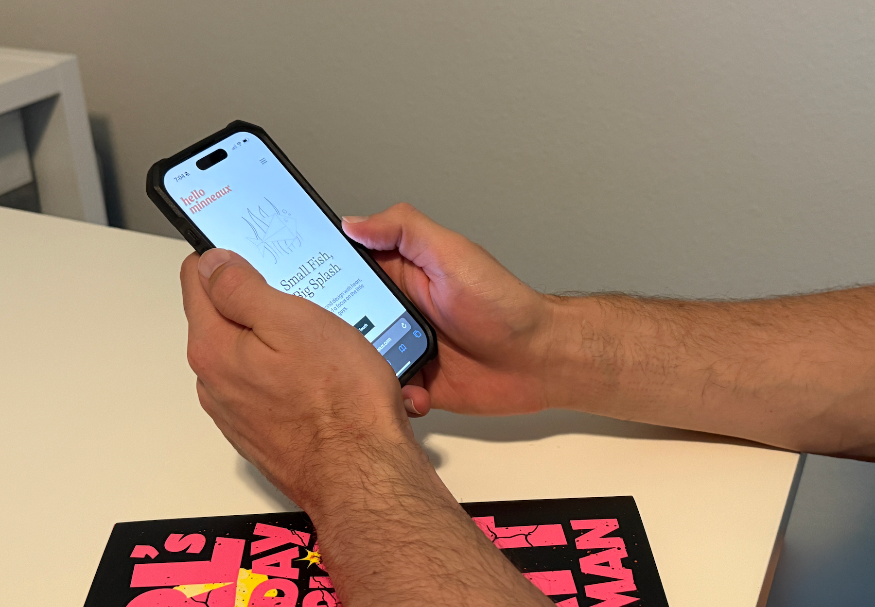
If your website doesn’t work well on a phone, you might be losing more than half your visitors before they even read your headline. In 2025, mobile browsing isn’t just common — it’s the default for most people.

According to Google, over 60% of all website visits worldwide now come from mobile devices, and 74% of users say they’re more likely to return to a mobile-friendly site. That’s not just a trend — it’s your customer base telling you exactly what they want.

Why Mobile-Friendly Design Matters

Mobile-friendly websites aren’t just about looking good on a smaller screen. They directly affect:

  • First impressions – 57% of users won’t recommend a business with a poorly designed mobile site.
  • Conversion rates – Mobile-friendly sites see up to a 2x increase in conversions compared to desktop-only designs.
  • SEO rankings – Google switched to mobile-first indexing years ago, meaning your site’s mobile version is the primary one it evaluates.

What Counts as Mobile-Friendly?

It’s more than “shrinking” your site down. A truly mobile-friendly site:

  • Uses responsive design so content adapts to any screen size
  • Keeps navigation simple and thumb-friendly
  • Loads fast, even on slower connections
  • Uses readable font sizes without pinching or zooming
  • Avoids tiny links or buttons that are hard to tap

Local Impact: Louisiana’s On-the-Go Customers

In Louisiana, many small business customers are looking you up while they’re out and about — searching for a restaurant after a parade, checking gym hours between errands, or browsing services while waiting in the carpool line.

If your site isn’t easy to use on mobile, you could be losing local leads to a competitor who invested in responsive design.

Quick Wins for Going Mobile-Friendly

If your website is more “frustrating” than “friendly” on a phone, here’s where to start:

  1. Run a Mobile-Friendly Test (Google offers a free one)
  2. Simplify your navigation – Fewer menu items, clear labels
  3. Speed things up – Compress images and minimize code
  4. Test on real devices – Not just in a desktop browser window
  5. Work with a pro – A web designer can implement responsive design without breaking your brand style

Bottom Line:

The majority of your visitors are on mobile — and they expect your site to work seamlessly. If you don’t give them that experience, they won’t stick around. A mobile-friendly design isn’t just good practice — it’s the new standard for doing business online.

Helpful Links:

Keep Reading

More Creative Insights

Dinner scene still from Wes Anderson's 2025 film The Phoenician Scheme

Branding Through a Wes Anderson Lens: Finding Design Inspiration in the Films You Love

July 28, 2025

From Wes Anderson’s dreamy color palettes to the movies, places, and objects we personally love, design inspiration is everywhere. Your brand doesn’t have to be generic — it can be you, right down to the hex codes. In this post, I’m sharing how to pull meaningful brand inspiration from film, color, and the little things that spark joy.

Read More
Stock image of a Pantone book. Branding and logo services offered by Hello Minneaux.

Do I Need a Logo, a Brand, or Both? A Simple Guide for Small Businesses

May 31, 2025

What’s the difference between a logo and a full brand identity — and which do you really need? Here’s a clear, simple guide for Louisiana small businesses.

Read More
Image of Covington Louisiana. Hello Minneaux is a Northshore based design agency.

What to Know Before Hiring a Web Designer on the Northshore

May 24, 2025

Hiring a web designer? Here are 5 things every small business owner should know — especially if you're based in Mandeville, Covington, or the Northshore.

Read More

Let's start a conversation.